Layred
Layred Shop & eCommerce Shopify Theme | W3itexperts
This documentation is last updated on 20 June 2025
Install Theme
Step 1: Upload Theme Source
To install the theme:
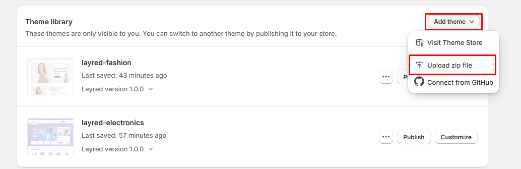
- 1. Please log in to your Shopify store, click Online Store.
- 2. At Theme Library, click Add theme, choose Upload zip file.
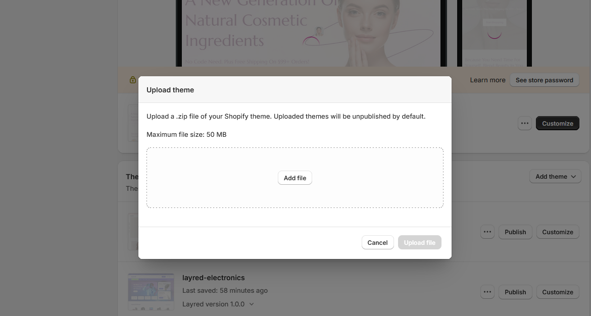
- 3. The Upload Theme dialog displays. Click Add File or drop file to upload to select the .zip file you want to upload.
- 4. Click Upload file.
- 5. Wait until the uploading process finishes. Then click Publish button to active the source to be live.

Step 2: Upload Settings Data For Home Page
- 1. Click the file to download its JSON layout and view the data in a new tab.
- 2. SELECT ALL and COPY.
- 3. From your Shopify admin, go to Themes → Actions → Edit Code.

- 4. Navigate to the "Templates" folder, open the "index.json" file, → SELECT ALL and DELETE then PASTE the copied preset from the external file

Step 3: Upload Settings Data For Theme Settings
- 1. Click the file to download its JSON layout and view the data in a new tab.
- 2. SELECT ALL and COPY.
- 3. From your Shopify admin, go to Themes → Actions → Edit Code.
- 4. Navigate to the "Templates" folder, open the "settings_data.json" file, → SELECT ALL and DELETE then PASTE the copied preset from the external file

Preset For Home Page
| Home Pages | Json (with .json format) | Json (with .json format) |
|---|---|---|
| Home 01 - Cosmetics | index-1.json | settings-data-1.json |
| Home 02 - Electronics | index-2.json | settings-data-2.json |
| Home 03 - Fashion | index-3.json | settings-data-3.json |
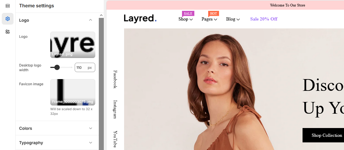
Logo Settings
You can customize your store's logo from the Theme Settings panel. This section allows you to upload a custom logo image to appear in your store header.
Instructions
- Go to Online Store → Themes in your Shopify admin.
- Click Customize next to your current theme.
- Click Theme Settings from the left sidebar.
- Select the Branding (or "Logo" / "Favicon") section.
- Upload your Logo and Favicon images.
- Adjust logo width (optional).
- Click Save.
Colors Settings
Customize the look and feel of your store by configuring theme colors in the Theme Settings → Colors section. You can change background, text, button, and link colors to match your brand.
How to Change Theme Colors
- From your Shopify admin, go to Online Store → Themes.
- Click Customize for your active theme.
- In the editor sidebar, click Theme Settings.
- Choose the Colors section.
- Adjust the following color options:
-
Global
Primary Used for buttons, links, text selection color, progress bar and link hover. Secondary Used for main buttons, active tab background, price range slider (e.g., Add to Cart, Buy Now). Success Used in success messages or status labels (e.g., "Order placed successfully"). Danger Used in error messages, delete buttons, or warnings. Warning Used for cautionary alerts, notifications, or statuses needing attention.
-
Heading
Headings Color Applied to headings (h1–h6), section titles, and major UI text labels.
-
Body
Text Color Default body text color across pages, product descriptions, footers, etc.
-
Border
Border Color Used for dividers, card outlines, input field borders, etc.
-
Background
Background Main page background (applied to body, containers, or sections). Background 2 Used in some sections background.
-
Input
Text color Used for input text color. Placeholder Color Used for input placeholder color. Border Color Used for input border color. Background Used for input background color.
-
Collection card
Text color Used for collection card text color. Border Color Used for collection card border color. Background Used for collection card background color. Shadow Used for collection card shadow color.
-
Blog card
Title color Used for blog card title color. Text color Used for blog card text color. Link color Used for blog card link color. Border color Used for blog card border color. Background Used for blog card background color. Shadow Used for blog card shadow color. Badge background Used for blog card date badge background color. Badge color Used for blog card date badge text color.
-
Dropdown and pop-ups
Text color Used for dropdown text color. Border color Used for dropdown border color. Background Used for dropdown background color. Shadow Used for dropdown shadow color.
-
Drawer
Background Used for drawer background color.
Typography Settings
The Typography section allows you to customize how text appears across your store by setting font families, sizes, and weights for headings and body content. This ensures consistency in design and readability.
How to Access
- Go to Online Store → Themes in your Shopify admin.
- Click Customize on your active theme.
- Open Theme Settings → Typography.
Typography Options Explained
Headings
- Select font type: Choose between Shopify fonts or Google Fonts.
- Google font URL: (Optional) Custom URL if you're importing a Google font manually.
- Google font name: The name of the Google font to be used (e.g., "Plus Jakarta Sans").
- Font: Pick a font if you're using Shopify fonts.
- Font size scale: Adjusts heading size relative to its default (e.g., 100% = default size).
- Font weight: Sets how bold headings appear — options usually include Regular, Medium, Bold, Semi Bold, etc.
Body
- Select font type: Choose between Shopify fonts or Google Fonts.
- Google font URL: Optional URL for manual font loading.
- Google font name: Name of the body font (should match the actual Google Font name).
- Font: Pick a font if you're using Shopify fonts.
- Font size scale: Sets the base font size for paragraphs, product details, navigation, etc. (e.g., 16px).
Where These Are Used
| Setting | Used In |
|---|---|
| Headings Font | Page titles, product titles, section headings, banners, headers (h1–h6) |
| Body Font | Product descriptions, cart details, footer text, navigation menus, general body copy |
| Font Weight | Affects how bold the headings appear (can emphasize or deemphasize key text) |
| Font Size (Body) | Applies to paragraphs, list items, input text, and most regular content blocks |
General Settings
Configure foundational settings for your store’s layout and functionality using the General Settings panel. Below are the adjustable options with their purposes:
How to Access
- Go to Online Store → Themes.
- Click Customize on your active theme.
- In the left sidebar, navigate to Theme Settings → General.
Options Explained
- Page Width: Adjust the overall container width (e.g., 1300px) to control the layout’s max width.
- Wishlist: Enable or disable wishlist functionality for users to save favorite products and receive email reminders.
- Terms and Conditions Checkbox: Toggle to display a checkbox during checkout with custom text, link, and content.
- Lazyload Image: Improve page performance by loading images only when needed.
- Hot Stock Function: Set a threshold to highlight low stock items (e.g., “Only 20 left in stock!”).
- Trust Image: Add a trust badge image (e.g., secure checkout, quick delivery) with image upload support.
Layout Settings
The Layout section allows you to control the overall structure of your storefront. In this specific setting, you can choose between different predefined header layouts to best match your store’s branding and navigation needs.
How to Access
- Go to Online Store → Themes.
- Click Customize on your active theme.
- In the left sidebar, navigate to Theme Settings → Layout.
Header Layout Options
Under the Header section, you can select from available layout presets for the header of your store.
- Header 1: A default layout with logo on the left, navigation menu in the center or right, and icons (search, cart, account) aligned right.
- Header 2: Top row includes social icons (Facebook, Instagram, YouTube) on the left, Center-aligned logo, Right-aligned icons: language selector, search, account, wishlist, cart, Navigation bar appears below the logo, Good for modern and lifestyle brands
- Header 3: Logo left, center search bar, right-side wishlist/cart icons, large "Shop Categories" button left of nav, nav below, and a 🔥 Sale 20% Off badge—ideal for large or category-driven stores.
Buttons Settings
Customize the appearance and spacing of buttons across your store. These options ensure consistency and control over visual hierarchy.
How to Access
- Go to Online Store → Themes.
- Click Customize on your active theme.
- In the left sidebar, navigate to Theme Settings → Buttons.
Buttons Options
- Border Thickness: Adjust the line thickness of the button border (e.g., 1px).
- Corner Radius: Set the roundness of button corners (e.g., 0px for square, higher values for rounded edges).
- Padding Top/Bottom: Control vertical spacing inside buttons to adjust height (e.g., 12px).
- Padding Left/Right: Control horizontal spacing for button width and label padding (e.g., 30px).
Inputs Settings
These options allow you to customize the look and feel of input fields such as forms, search bars, and checkout fields for a cohesive UI.
How to Access
- Go to Online Store → Themes.
- Click Customize on your active theme.
- In the left sidebar, navigate to Theme Settings → Inputs.
Inputs Options
- Border Thickness: Defines the line width around input fields (e.g., 1px).
- Corner Radius: Controls how rounded the corners of input fields are (e.g., 0px for sharp corners).
- Padding Top/Bottom: Sets the vertical spacing within input fields (e.g., 12px).
- Padding Left/Right: Sets the horizontal spacing inside the input fields (e.g., 18px).
Product Card Settings
These options allow you to customize the appearance and functionality of product cards in your store's collection pages.
How to Access
- Go to Online Store → Themes.
- Click Customize on your active theme.
- In the left sidebar, navigate to Theme Settings → Product Cards.
Product Card Options
Display Options
- Show wishlist icon: Toggles visibility of the wishlist button on product cards.
- Show quick view: Enables/disables the quick view functionality.
- Show add to cart: Controls visibility of the add to cart button.
- Show size variant: Displays available size options.
- Show color variant: Displays available color options.
- Show product vendor: Toggles visibility of the vendor name.
- Show product review: Controls display of product ratings.
- Show product price: Toggles price visibility.
Product Badges
- Show Product Badges: Master toggle for all badge types.
- Show New Badge: Displays "New" badges on qualifying products.
- New Badge Type: Dynamic or Manual selection
- New Badge Time Show: Duration to show as new (e.g., 15 days)
- New Badge Maximum Products: Limit of products to show as new (e.g., 30)
- Show Sale Badge: Displays sale badges.
- Sale Badge Type: (percentage + Discount) / Text / (Text + percentage + Discount)
- Show Soldout Badge: Indicates out-of-stock products.
Product Action
- Corner radius: Controls button rounding (e.g., 0px for square corners).
Cart Button
- Corner radius: Controls Cart button rounding (e.g., 0px for square corners).
Border
- Thickness: Sets border width in pixels
- Corner radius: Controls All Card rounding (e.g., 0px for square corners).
Image margin
- Top margin: Space above image
- Bottom margin: Space below image
- Left margin: Space to image's left
- Right margin: Space to image's right
Padding
- Top padding: Inner top spacing
- Bottom padding: Inner bottom spacing
- Left padding: Inner left spacing
- Right padding: Inner right spacing
Shadow
- Horizontal offset: Shadow left/right position
- Vertical offset: Shadow top/bottom position
- Blur: Shadow softness
- Opacity: Shadow transparency (0-100%)
Product Typography Settings
These options allow you to customize the typography for product elements throughout your store.
How to Access
- Go to Online Store → Themes.
- Click Customize on your active theme.
- In the left sidebar, navigate to Theme Settings → Typography (Product).
Product Typography Options
Product Title
- Font family: Sets the Font family for product titles
- Font size: Controls the text size (e.g., 16px)
- Font weight: Adjusts text thickness (e.g., Medium)
- Letter spacing: Controls character spacing (e.g., 0px)
- Text transform: Modifies text capitalization (e.g., Capitalize)
Product Price
- Font size: Controls the price text size (e.g., 16px)
- Font weight: Adjusts price text thickness (e.g., Semi bold)
Product Color Settings
These options allow you to customize the color scheme for product elements throughout your store.
How to Access
- Go to Online Store → Themes.
- Click Customize on your active theme.
- In the left sidebar, navigate to Theme Settings → Colors (Product).
Product Color Options
Product Card
- Background color: Sets the card background (Default: Transparent)
- Border color: Controls the border color (Default: Transparent)
- Image background: Background behind product images (Default: #F4F4F4)
- Shadow: Color of card shadow effects (Default: Transparent)
Product Title
- Text color: Main title color (Default: #000000)
- Text hover color: Title color on hover (Default: #005284)
Product Price
- Text color: Price text color (Default: #000000)
Product Vendor
- Text color: Vendor name color (Default: #DD2831)
Product Badges
- New badge:
- Background: Badge fill color (Default: #005284)
- Text: Badge text color (Default: #FFF)
- Sale badge:
- Background: Badge fill color (Default: #000000)
- Text: Badge text color (Default: #FFF)
- Sold out badge:
- Background: Badge fill color (Default: #FFFFFF)
- Text: Badge text color (Default: #949494)
Product Action
- Text color: Product Action icon color
- Background color: Product Action background color
- Border Color: Product Action border color
- Text Hover Color: Product Action hover text color
- Background Hover color: Product Action hover background color
- Border Hover color: Product Action hover border color
Collection Card Settings
These options allow you to customize the appearance of collection cards throughout your store.
How to Access
- Go to Online Store → Themes.
- Click Customize on your active theme.
- In the left sidebar, navigate to Theme Settings → Collection Cards.
Collection Card Options
Text Alignment
- Alignment options:
- Left: Aligns text to the left
- Center: Centers text horizontally
- Right: Aligns text to the right
Border Styling
- Thickness: Sets border width (Default: 0px)
- Corner radius: Controls card rounding (Default: 0px)
Spacing
- Padding (top/bottom): Vertical inner spacing (Default: 20px)
- Padding (left/right): Horizontal inner spacing (Default: 20px)
Shadow Effects
- Horizontal offset: Left/right shadow position (Default: 0px)
- Vertical offset: Top/bottom shadow position (Default: 0px)
- Blur: Shadow softness (Default: 20px)
- Opacity: Shadow transparency (Default: 0%)
Blog Cards Settings
These options allow you to customize the appearance of blog post cards throughout your store.
How to Access
- Go to Online Store → Themes.
- Click Customize on your active theme.
- In the left sidebar, navigate to Theme Settings → Blog Cards.
Blog Card Options
Card Style
- Style selection:
- Style 1: Elegance Unveiled Style - Date-highlighted fashion posts with compact typography and excerpt preview.
- Style 2: Flawless Skin Style - Bold skincare guides with headline/subtitle structure and no excerpt.
- Style 3: Beauty Benefits Style - Minimalist product-focused cards with month headers and "Read More" CTAs.
Border Styling
- Thickness: Sets border width (Default: 0px)
- Corner radius: Controls card rounding (Default: 0px)
Spacing
- Padding (top/bottom): Vertical inner spacing (Default: 30px)
- Padding (left/right): Horizontal inner spacing (Default: 30px)
Shadow Effects
- Horizontal offset: Left/right shadow position (Default: 1px)
- Vertical offset: Top/bottom shadow position (Default: 1px)
- Blur: Shadow softness (Default: 0px)
- Opacity: Shadow transparency (Default: 1%)
Dropdowns and Pop-ups Settings
These options control the styling of interactive elements including navigation dropdowns, pop-up modals, and cart drawers.
How to Access
- Go to Online Store → Themes.
- Click Customize on your active theme.
- In the left sidebar, navigate to Theme Settings → Dropdowns and pop-ups.
Styling Options
Border
- Thickness: Controls border width (Default: 0px)
- Corner radius: Adjusts corner rounding (Default: 0px)
Shadow
- Horizontal offset: Left/right shadow position (Default: 0px)
- Vertical offset: Top/bottom shadow position (Default: 20px)
- Blur: Shadow softness (Default: 40px)
- Opacity: Shadow transparency (Default: 1%)
Badge Settings
Customize the appearance of product badges including sale, new, and sold-out indicators.
How to Access
- Go to Online Store → Themes.
- Click Customize on your active theme.
- Navigate to Theme Settings → Badges.
Badge Styling Options
Border
- Corner radius: Controls the rounding of badge corners
Spacing
- Padding (top/bottom): Vertical internal spacing
- Padding (left/right): Horizontal internal spacing
- Sale badges
- New product badges
- Sold-out indicators
Brand Information Settings
Configure your store's brand details that appear in the footer and other key sections.
How to Access
- Go to Online Store → Themes.
- Click Customize on your active theme.
- In the left sidebar, navigate to Theme Settings → Brand Information.
Brand Information Options
- Brand Description:
- Add a brief description about your brand
- Appears in the store's footer section
- Contact Information:
- Address: Your physical business location (Example: 451 Wall Street, UK, London)
- Email: Primary contact email (Example: example@info.com)
- Phone Number: Customer service number (Example: 5156484868)
- Website footer
- Contact pages
Social Media Settings
Configure your store's social media accounts and sharing options to enhance customer engagement.
How to Access
- Go to Online Store → Themes.
- Click Customize on your active theme.
- In the left sidebar, navigate to Theme Settings → Social Media.
Social Media Options
Social Sharing Options
- Share on Facebook: Enable/disable product sharing to Facebook
- Share on Twitter (X): Enable/disable product sharing to Twitter/X
- Share on Pinterest: Enable/disable product sharing to Pinterest
Social Accounts
- Facebook:
https://www.facebook.com/ - Instagram:
https://www.instagram.com/ - LinkedIn:
https://www.linkedin.com/company/shopify - YouTube:
https://youtube.com/ - TikTok:
https://tiktok.com/@shopify - X/Twitter:
https://x.com/shopify - Snapchat:
https://www.snapchat.com/add/shopify - Pinterest:
https://pinterest.com/shopify - Tumblr:
https://shopify.tumblr.com - Vimeo:
https://vimeo.com/shopify
- Social icons will appear in your footer and/or header
- Sharing options appear on product pages when enabled
- URLs must include full https:// protocol
Search Behavior Settings
Configure how your store's search functionality behaves and what suggestions are displayed to customers.
How to Access
- Go to Online Store → Themes.
- Click Customize on your active theme.
- In the left sidebar, navigate to Theme Settings → Search Behavior.
Search Configuration Options
Search Keywords
- Enable search keywords: Toggle to activate popular searches feature
- Title: Section header text (Default: "Popular Searches")
- Keywords: Comma-separated list of suggested terms (Example: Jacket, Top, Bottom)
Search Suggestions
- Enable search suggestions: Toggle to show real-time product suggestions
- Show product vendor: Display brand names in suggestions (Requires suggestions enabled)
- Show product price: Display prices in suggestions (Requires suggestions enabled)
- Keywords appear when no search term has been entered yet
- Suggestions appear as customers type in the search field
- Comma-separated keywords support up to 50 entries
Notify Me: Out of Stock Settings
Configure the back-in-stock notification system that lets customers sign up for product availability alerts.
How to Access
- Go to Online Store → Themes.
- Click Customize on your active theme.
- In the left sidebar, navigate to Theme Settings → Notify Me: Out of Stock.
Notification Settings
General Configuration
- Show Notify Me: Out of Stock: Enable/disable the entire notification feature
- Email Collection: System will collect and store customer email addresses for notifications
- Form Title: Header text for the notification form (Default: "Back in stock alert")
- Description: Explanatory text shown to customers (Default: "We will send you a notification as soon as this product is available again.")
- Appears automatically on product pages when inventory reaches zero
- Email addresses are stored securely for single-use notifications
- Notifications are sent automatically when inventory is updated
- Customers can unsubscribe from any notification email
Cart Free Shipping Settings
Configure free shipping messages and progress bar to encourage customers to reach the free shipping threshold.
How to Access
- Go to Online Store → Themes.
- Click Customize on your active theme.
- Navigate to Theme Settings → Cart Free Shipping.
Free Shipping Configuration
General
- Show Free Shipping Message: Enable/disable the free shipping notification
- Free Shipping Threshold: Order amount needed to qualify (Default: 400)
Progress Bar
- Height: Bar thickness in pixels (Default: 8px)
- Rounded Border: Corner radius in pixels (Default: 8px)
- Show Shipping Truck: Toggle truck icon visibility
- Text Color: Message text color (Default: #67697E)
- Background Color: Empty bar color (Default: #F5F5F5)
- Progress Fill Colors:
- < 30%: Fill color (Default: #0052B4)
- < 60%: Fill color (Default: #0052B4)
- < 100%: Fill color (Default: #0052B4)
- = 100%: Fill color (Default: #0052B4)
- Progress bar updates in real-time as cart value changes
- Colors can be customized for different progress stages
- System automatically converts currency amounts
- Appears in cart drawer/page and checkout
Currency Format Settings
Configure how currency values and codes are displayed throughout your store.
How to Access
- Go to Online Store → Themes.
- Click Customize on your active theme.
- Navigate to Theme Settings → Currency Format.
Currency Display Options
Currency Codes
- Show currency codes: Toggle to display currency codes (e.g., USD, EUR) with prices
- Display behavior: Codes will always appear in cart and checkout (Example: $1.00 USD)
- Product pages: Optional display on product price tags
- Currency codes help international customers understand pricing
- Format automatically adjusts to your store's primary currency
- Codes appear after the amount (e.g., €10.00 EUR)
- Required in cart/checkout when multiple currencies are enabled
Cart Settings
Configure the appearance and functionality of your store's shopping cart.
How to Access
- Go to Online Store → Themes.
- Click Customize on your active theme.
- Navigate to Theme Settings → Cart.
Cart Configuration Options
Cart Type
- Drawer: Slide-out panel from side of screen
- Page: Dedicated full-page cart view
Display Options
- Show vendor: Display product vendor names
- Enable cart note: Allow customers to add order notes
- Show Shipping Fee Calculator: Enable shipping cost estimates
- Show Coupon Input Field: Allow discount code entry
Gift Options
- Show Gift Wrap: Enable gift wrapping service
- Gift Card Product: Select which product to use for gift wrapping
- Gift Label Content: Custom message (Default: "Do you want a Gift Wrap? Only For $10.00")
- Cart type affects all cart interactions site-wide
- Gift wrap appears as an optional product add-on
- HTML tags supported in gift label content
- Changes apply to both desktop and mobile views
Newsletter Popup Settings
Configure your email collection popup to convert visitors into subscribers and customers.
How to Access
- Go to Online Store → Themes.
- Click Customize on your active theme.
- Navigate to Theme Settings → Newsletter Popup.
Newsletter Popup Options
Activation Settings
- Enable newsletter popup: Master toggle for the entire feature
- Cookie duration: How long before showing again to same visitor (Default: 1 day)
- Delay time: When popup appears after page load (Default: 3 seconds)
Content Configuration
- Image: Background/side image selection (Browse free stock images)
- Subtitle: Small header text (Default: "Newsletter")
- Heading: Main promotional text (Default: "Sign up and get 20% off your first order")
- Description: Supporting details (Matches heading by default)
- Bottom info: Disclaimer text (Default: "Discount Only For First Time Subscribers")
- Popup respects visitor privacy with cookie tracking
- Mobile-responsive design
- Discount codes are automatically generated and emailed
- Subscribers added to your email marketing list
- Image recommended size: 600×400px (adjusts for all devices)
Announcement Bar Settings
Configure the promotional bar that appears at the top of your store to highlight important messages.
How to Access
- Go to Online Store → Themes.
- Click Customize on your active theme.
- Navigate to Header → Announcement Bar.
Announcement Bar Options
Color Settings
- Background color: Sets the bar's background (Default: #FFD4D4)
- Text color: Controls announcement text color (Default: #000000)
Announcement Behavior
- Auto-rotate announcements: Enable automatic cycling of multiple messages
- Rotation interval: Time between message changes (Default: 5 seconds)
Text Styling
- Font size: Announcement text size (Default: 13px)
- Font weight: Text thickness (Default: Normal)
- Letter spacing: Character spacing (Default: 0px)
- Text transform: Capitalization style (Default: Capitalize)
Spacing
- Top padding: Space above content (Default: 5px)
- Bottom padding: Space below content (Default: 5px)
- Appears site-wide at the top of every page
- Supports multiple announcements when auto-rotate is enabled
- Mobile-responsive with adjusted spacing
- Changes appear immediately after publishing
Header - 1 Configuration
Customize your store's header appearance and functionality including navigation, icons, and menu labels.
How to Access
- Go to Online Store → Themes.
- Click Customize on your active theme.
- Select Header from the top navigation.
Note: you can change header layout from theme settings.
Header Options
Main Header
- Menu: Select main navigation menu
- Background color: Main header background color
- Show separator line: Toggle on/off
- Sticky Header: Enable/disable
Region & Language
- Country/region selector: Enable/disable (configure in Markets)
- Language selector: Enable/disable (configure in Languages)
Header Icons
- Customer accounts: Show/hide login icon
- Cart: Show/hide cart icon
- Search: Show/hide search icon
Wishlist
- Show Wishlist Icon: Toggle on/off
Menu Typography
- Font size: main menu font size
- Font weight: main menu font weight
- Letter spacing: main menu font size letter spacing
- Text transform: main menu text transform
- Text color: main menu text color
- Text Hover Color: main menu text hover color
- Menu alignment: main menu text alignment (Left/Center/Right)
Sale Link
- Label: Gradient link label text
- URL: Gradient link url
- Position: link position (Left/Center/Right)
Dropdown
- Background color: Header menu dropdown background color
- Font size: Header menu items font size
- Font weight: Header menu items font weight
- Text transform: Header menu items text transform
- Text color: Header menu items text color
- Text Hover Color: Header menu items text hover color
Dropdown menu title
- Font size: Dropdown mega menu title font size
- Font weight: Dropdown mega menu title font weight
- Text transform: Dropdown mega menu title text transform
- Text color: Dropdown mega menu title text color
- Text Hover Color: Dropdown mega menu title text hover color
Menu Labels
Note: Add the menu item name in the field where you want to add the label.
- New label:
- Label style: Style 1/Style 2
- Application Levels:
- Level 1: Applies to primary menu items
- Level 2: Applies to first dropdown level
- Level 3: Applies to nested submenu items
- Text color: Menu label badge text color
- Background color: Menu label badge background color
- Sale label:
- Label style: Style 1/Style 2
- Application Levels:
- Level 1: Applies to primary menu items
- Level 2: Applies to first dropdown level
- Level 3: Applies to nested submenu items
- Text color: Menu label badge text color
- Background color: Menu label badge background color
- Hot label:
- Label style: Style 1/Style 2
- Application Levels:
- Level 1: Applies to primary menu items
- Level 2: Applies to first dropdown level
- Level 3: Applies to nested submenu items
- Text color: Menu label badge text color
- Background color: Menu label badge background color
- Changes apply immediately after saving
- Color codes use hex format (e.g. #FFFFFF for white)
- Menu labels appear based on navigation configuration
Header - 2 Configuration
Customize your store's header appearance and functionality including navigation, icons, and menu labels.
How to Access
- Go to Online Store → Themes.
- Click Customize on your active theme.
- Select Header from the top navigation.
Note: you can change header layout from theme settings.
Header Options
Main Header
- Menu: Select main navigation menu
- Background color: Main header background color
- Show separator line: Toggle on/off
- Sticky Header: Enable/disable
Region & Language
- Country/region selector: Enable/disable (configure in Markets)
- Language selector: Enable/disable (configure in Languages)
Header Icons
- Customer accounts: Show/hide login icon
- Cart: Show/hide cart icon
- Search: Show/hide search icon
Wishlist
- Show Wishlist Icon: Toggle on/off
Header top info
- Menu:Select Header top navigation menu
- Background color: Header top background color
- Text color: Header top text color
- Border color: Header top border color
- Border bottom: Header top border bottom visibility
- Show social icons: Header top social icon visibility
Menu Typography
- Font size: main menu font size
- Font weight: main menu font weight
- Letter spacing: main menu font size letter spacing
- Text transform: main menu text transform
- Text color: main menu text color
- Text Hover Color: main menu text hover color
- Menu alignment: main menu text alignment (Left/Center/Right)
Sale Link
- Label: Gradient link label text
- URL: Gradient link url
- Position: link position (Left/Center/Right)
Dropdown
- Background color: Header menu dropdown background color
- Font size: Header menu items font size
- Font weight: Header menu items font weight
- Text transform: Header menu items text transform
- Text color: Header menu items text color
- Text Hover Color: Header menu items text hover color
Dropdown menu title
- Font size: Dropdown mega menu title font size
- Font weight: Dropdown mega menu title font weight
- Text transform: Dropdown mega menu title text transform
- Text color: Dropdown mega menu title text color
- Text Hover Color: Dropdown mega menu title text hover color
Menu Labels
Note: Add the menu item name in the field where you want to add the label.
- New label:
- Label style: Style 1/Style 2
- Application Levels:
- Level 1: Applies to primary menu items
- Level 2: Applies to first dropdown level
- Level 3: Applies to nested submenu items
- Text color: Menu label badge text color
- Background color: Menu label badge background color
- Sale label:
- Label style: Style 1/Style 2
- Application Levels:
- Level 1: Applies to primary menu items
- Level 2: Applies to first dropdown level
- Level 3: Applies to nested submenu items
- Text color: Menu label badge text color
- Background color: Menu label badge background color
- Hot label:
- Label style: Style 1/Style 2
- Application Levels:
- Level 1: Applies to primary menu items
- Level 2: Applies to first dropdown level
- Level 3: Applies to nested submenu items
- Text color: Menu label badge text color
- Background color: Menu label badge background color
- Changes apply immediately after saving
- Color codes use hex format (e.g. #FFFFFF for white)
- Menu labels appear based on navigation configuration
Header - 3 Configuration
Customize your store's header appearance and functionality including navigation, icons, and menu labels.
How to Access
- Go to Online Store → Themes.
- Click Customize on your active theme.
- Select Header from the top navigation.
Note: you can change header layout from theme settings.
Header Options
Main Header
- Menu: Select main navigation menu
- Background color: Main header background color
- Show separator line: Toggle on/off
- Sticky Header: Enable/disable
Region & Language
- Country/region selector: Enable/disable (configure in Markets)
- Language selector: Enable/disable (configure in Languages)
Header Icons
- Customer accounts: Show/hide login icon
- Cart: Show/hide cart icon
- Search: Show/hide search icon
Wishlist
- Show Wishlist Icon: Toggle on/off
Header top info
- Background color: Header top background color
- Text color: Header top text color
- Border color: Header top border color
- Border bottom: Header top border bottom visibility
Header searchbar
- Enable Search bar: Show/Hide header top search bar
- Background: Header top search bar background color
- Text color: Header top search bar input text color
- Placeholder Color: Header top search bar input placeholder color
- Border color: Header top search bar input border color
- Border width: Header top search bar input border width
- Border radius: Header top search bar input border radius
- Button background: Header top search bar input right side search button background color
- Button text color: Header top search bar input right side search button text color
Menu Typography
- Font size: main menu font size
- Font weight: main menu font weight
- Letter spacing: main menu font size letter spacing
- Text transform: main menu text transform
- Text color: main menu text color
- Text Hover Color: main menu text hover color
- Menu alignment: main menu text alignment (Left/Center/Right)
Sale Link
- Label: Gradient link label text
- URL: Gradient link url
- Position: link position (Left/Center/Right)
Dropdown
- Background color: Header menu dropdown background color
- Font size: Header menu items font size
- Font weight: Header menu items font weight
- Text transform: Header menu items text transform
- Text color: Header menu items text color
- Text Hover Color: Header menu items text hover color
Dropdown menu title
- Font size: Dropdown mega menu title font size
- Font weight: Dropdown mega menu title font weight
- Text transform: Dropdown mega menu title text transform
- Text color: Dropdown mega menu title text color
- Text Hover Color: Dropdown mega menu title text hover color
Menu Labels
Note: Add the menu item name in the field where you want to add the label.
- New label:
- Label style: Style 1/Style 2
- Application Levels:
- Level 1: Applies to primary menu items
- Level 2: Applies to first dropdown level
- Level 3: Applies to nested submenu items
- Text color: Menu label badge text color
- Background color: Menu label badge background color
- Sale label:
- Label style: Style 1/Style 2
- Application Levels:
- Level 1: Applies to primary menu items
- Level 2: Applies to first dropdown level
- Level 3: Applies to nested submenu items
- Text color: Menu label badge text color
- Background color: Menu label badge background color
- Hot label:
- Label style: Style 1/Style 2
- Application Levels:
- Level 1: Applies to primary menu items
- Level 2: Applies to first dropdown level
- Level 3: Applies to nested submenu items
- Text color: Menu label badge text color
- Background color: Menu label badge background color
- Changes apply immediately after saving
- Color codes use hex format (e.g. #FFFFFF for white)
- Menu labels appear based on navigation configuration
Blog Listing Settings
How to Access
- Go to Online Store → Themes
- Click Customize on your active theme
- Navigate to Sections → Blog listing
General Settings
- Background color: Applies to the entire blog section
- Layout width: Controls container vs full-width display
- Blog selection: Choose between "Blog" or "News" content
Heading Section
- Title text: Main heading (e.g., "Latest Stories")
- Typography: Applies to the section heading
- Bottom spacing: Controls gap below heading
Post Cards
- Content elements: Toggle date/author/excerpt/read more
- Image handling: Controls how images are displayed
- Posts per page: Limits number of visible articles
Grid Layout
- Desktop columns: Sets 2-column grid on large screens
- Tablet columns: Choose 1 or 2 columns
- Mobile columns: Choose 1 or 2 columns
View All Button
- Button label: Custom text (e.g., "View all posts")
- Link destination: Typically links to blog index
- Visibility: Hide by leaving label blank
Section Spacing
- Desktop padding: Top and bottom spacing
- Mobile padding: Reduced spacing for mobile
- 3:2 image ratio recommended for consistent display
- Mobile layout triggers below 768px screen width
- Heading font scales automatically for different devices
Blog Slider Settings
How to Access
- Go to Online Store → Themes
- Click Customize on your active theme
- Navigate to Sections → Blog slider
General Settings
- Background color: Applies to slider container
- Layout width: Choose container or full-width display
- Blog selection: Pick which blog to feature
- Maximum articles: Limits posts in slider (max 6)
Heading Section
- Title text: Main heading above slider
- Typography: Controls heading appearance
- Bottom spacing: Gap between heading and slider
Post Card Settings
- Content elements: Toggle date/author/excerpt/read more
- Image ratio: Maintains 3:2 aspect ratio by default
Slider Behavior
- Slides per view: Number of visible posts (1-2)
- Space between: Gap between slides (20px)
- Autoplay: Enables automatic rotation
- Speed: Controls transition duration
Navigation Controls
- Arrows: Shows navigation buttons
- Arrow colors: Normal/hover states
- Pagination: Displays slide indicators
- Dot colors: Inactive/active states
Section Spacing
- Desktop padding: Top/bottom spacing
- Mobile padding: Adjusted spacing for mobile
- Use high-quality images with 3:2 ratio for best results
- Autoplay works only when slider contains 2+ posts
- Mobile always shows 1 slide for optimal readability
Brands Slider Settings
How to Access
- Go to Online Store → Themes
- Click Customize on your active theme
- Navigate to Sections → Brands Slider
General Settings
- Background color: Applies to the slider container (#FFFFFF)
- Layout width: Choose between container or full-width display
Slider Behavior
- Autoplay: Enables automatic sliding
- Autoplay delay: Sets pause duration between slides
- Visible items: Configure number of brands shown (desktop/tablet/mobile)
- Space between: Adjusts gap between brand logos
Brand Display
- Border: Toggles borders around brand logos
- Item height: Controls overall logo container size
- Image height: Adjusts logo scaling within container
Section Spacing
- Desktop padding: Top/bottom spacing (0px by default)
- Mobile padding: Adjusted spacing for smaller screens (0px by default)
- For best results, upload logos with transparent backgrounds
- Maintain consistent logo dimensions across all brands
- Autoplay works only when slider contains more items than visible
Blocks
Brand Configuration
- Brand image: Upload logo (supports PNG, JPG, SVG)
- Brand url: Set click destination URL
Call to Action Settings
How to Access
- Go to Online Store → Themes
- Click Customize on your active theme
- Navigate to Sections → Call to Action
Visual Styling
- Background color: Applies to the entire CTA section (#000)
- Text color: Affects all text within the CTA (#FFF)
Content Configuration
- Heading: Main promotional text with optional HTML formatting
- Button label: Customizable action text (e.g., "Get In Touch")
- Button link: Destination URL for the CTA button
Section Spacing
- Desktop padding: 25px top/bottom spacing on large screens
- Mobile padding: 25px top/bottom spacing on mobile devices
- Use contrasting colors for better readability (dark bg + light text)
- Keep button labels action-oriented (e.g., "Shop Now", "Contact Us")
- HTML span tags can highlight key phrases in headings
Category Listing 1 Settings
How to Access
- Go to Online Store → Themes
- Click Customize on your active theme
- Navigate to Sections → Category Listing 1
General Settings
- Background color: Applies to the entire section (#FFFFFF)
- Layout width: Choose between container or full-width display
Collection Display
- Text color: Default collection title color (#CCCCCC)
- Hover color: Title color on hover (#000000)
- Border style: 3px solid border (#000000)
Typography
- Font family: Uses heading font
- Font size: Responsive scaling (90px desktop → 30px mobile)
- Text styling: Medium weight, capitalized, 0px letter spacing
Spacing
- Internal spacing: 50px top/bottom, 70px left/right around items
- Desktop padding: 100px top/bottom section spacing
- Mobile padding: 30px top/bottom reduced spacing
- Use high-contrast colors for better hover effects
- 90px font works best with 1-3 word category titles
- Border appears around each collection block
Blocks
Collection
- Select image: Upload collection cover image (e.g., Tops.png)
- Title: Enter collection name (e.g., "Tops")
- Link: Set collection page destination
Category Listing 2 Settings
How to Access
- Go to Online Store → Themes
- Click Customize on your active theme
- Navigate to Sections → Category Listing 2
General Settings
- Background color: White (#FFF) background for the entire section
- Layout width: Choose container or full-width display
- Grid columns:
- 6 columns (desktop)
- 3 columns (tablet)
- 2 columns (mobile)
Heading Section
- Heading text: Customizable main title (e.g., "Because You Need Time for Yourself")
- Subheading: Secondary text line (e.g., "Blend Beauty in You")
- Text max width: Limits heading width to 800px
- Positioning:
- Horizontal position (Left/Center/Right)
- Text alignment (Left/Center/Right)
- Typography:
- Black (#000000) text color
- Heading font family
- Responsive sizing: 60px (desktop) → 40px (tablet) → 24px (mobile)
- Bottom spacing: 30px below heading (tablet/mobile)
Collection Items
- Text color: Black (#000000) for category titles
- Hover state: Maintains black (#000000) on hover
- Typography:
- Heading font family
- Responsive sizing: 24px (desktop) → 20px (tablet) → 16px (mobile)
- Normal weight, capitalized, 0px letter spacing
Section Spacing
- Desktop padding: 100px top/bottom
- Mobile padding: 40px top/bottom
- Use the 800px max width for optimal headline readability
- 6-column grid works best with 6+ categories for balanced layout
- Maintain consistent capitalization for uniform category titles
Blocks
Collection
- Select collection: Choose from your existing collections
- Select image: Upload or choose a featured image
Category Slider Settings
How to Access
- Go to Online Store → Themes
- Click Customize on your active theme
- Navigate to Sections → Category Slider
General Settings
- Background: White (#FFF) section background
- Layout: Container or full-width display
- Card styling:
- Light gray inner background (#FSFSFS)
- 10px rounded corners
- Responsive padding (40px desktop → 15px mobile)
Heading Section
- Title: "What's Hot" (customizable)
- Typography:
- Heading font family
- Medium weight, 0px letter spacing
- Responsive sizing: 28px → 18px
- Bottom spacing: 25px desktop → 15px mobile
- "View All" link:
- Black (#000000) text
- Customizable label and URL
Card Design
- Layout:
- White (#FFF) card background
- 10px border radius
- Responsive padding (30px/25px desktop → 20px/15px mobile)
- Category title:
- Black (#000000) semi-bold text
- 24px → 18px responsive sizing
- Heading font family
- Description:
- Gold (#EFAC56) body text
- Fixed 15px size across devices
Slider Behavior
- Autoplay: 3 second delay between slides
- Visible items:
- 4 (desktop)
- 2 (tablet)
- 1 (mobile)
- Item spacing: 20px between cards
- Section padding: 100px top/bottom desktop → 40px mobile
- Use 4+ categories for balanced desktop display
- Gold descriptions work best on white cards
- Mobile shows 1 card for optimal touch interaction
Blocks
Branding Elements
- Logo Image: Upload brand/collection logo
- Logo width: Set display width (default: 120px)
- Category Name: "Collection" (editable label)
- Category Image: Main collection image
Content Configuration
- Title: Collection name display
- Description: Add collection description text
- Link: Set destination URL
Content Box 1 Settings
How to Access
- Go to Online Store → Themes
- Click Customize on your active theme
- Navigate to Sections → Content Box 1
Visual Styling
- Background color: Applies to the entire section (#FFFF)
- Image selection: Choose from free library or upload custom
- Image position: Aligns image to left or right of text
Section Spacing
- Desktop padding: 100px top/bottom for large screens
- Mobile padding: 40px top/bottom for mobile devices
- Use high-quality images that match your brand colors
- Left-aligned images work best with right-to-left reading content
- Ensure text remains readable against the #FFFF background
Blocks
Heading
- Heading Text: Enter your headline content
- Example: "Elevate Your Style: A Unique Fashion Experience at Untouch"
- Font size:
- Desktop: 38px
- Tablet: 28px
- Mobile: 22px
- Font weight: Semi-bold
- Letter spacing: 0px (default)
- Text transform: None (standard capitalization)
- Text color: #000000 (black)
- Space below heading:
- Desktop: 30px
- Tablet: 25px
- Mobile: 15px
Text
- Text: Enter your paragraph text
User info
- Image: Upload or select an image for the user
- Name: Enter the name of the user
- Position: Enter the position of the user
Custom Liquid Settings
How to Access
- Go to Online Store → Themes
- Click Customize on your active theme
- Add a new section and select Custom Liquid
Liquid Code Implementation
- Code editor: Insert custom Liquid code snippets
- Usage examples:
- Create dynamic content
- Add app integrations
- Build custom functionality
Section Spacing
- Top padding: 40px default spacing
- Bottom padding: 52px default spacing
- Requires knowledge of Liquid templating language
- Test code changes in staging environment first
- Incorrect code may break site functionality
Customer Review Settings
How to Access
- Go to Online Store → Themes
- Click Customize on your active theme
- Navigate to Sections → Customer Reviews
General Settings
- Background colors:
- Section background: #FFF
- Content background: #F5F5F5
- Image selection: Choose from free library or upload custom
- Grid layout:
- Desktop/Tablet: 5 columns (image) + 7 columns (content)
- Mobile: Full-width (12 columns)
Content Structure
- Subtitle: "Testimonials" (customizable)
- Body font, 20px → 14px responsive sizing
- Medium weight, capitalized
- Black (#000000) text
- Main title: "Hear from our satisfied clients"
- Heading font, 55px → 22px responsive sizing
- Normal weight, black (#000000) text
Review Content
- Testimonial text:
- Body font, 30px → 16px responsive sizing
- Normal weight, black (#000000) text
- Customer name:
- Heading font, 24px fixed size
- Semi-bold, capitalized
- Customer designation:
- Body font, 14px fixed size
- Normal weight
Slider Controls
- Autoplay: 3 second rotation
- Navigation:
- Arrows: Black (#000000) with white hover (#FFF)
- Border: Light gray (#DEDEDE)
- Pagination:
- Inactive dots: Gray (#606060)
- Active dot: Black (#000000)
Section Spacing
- Desktop padding: 100px top/bottom
- Mobile padding: 30px top/bottom
- Use high-quality customer photos for credibility
- Keep testimonials concise (2-3 sentences)
- Black/white color scheme ensures readability
Blocks
Review
- Review content: Enter customer review content
- Customer image: Upload or select customer photo
- Customer name: Enter customer's name
- Customer designation: Enter customer's designation (optional)
Email Signup Settings
How to Access
- Go to Online Store → Themes
- Click Customize on your active theme
- Navigate to Sections → Email Signup
General Settings
- Background color: White (#FFF) section background
- Layout width: Container or full-width display
- Image column:
- 6 columns (desktop/tablet)
- Full-width on mobile (12 columns)
- Image selection: Choose from free library or upload custom
Content Layout
- Text column:
- 5 columns (desktop)
- 6 columns (tablet)
- Full-width on mobile (12 columns)
Text Content
- Subtitle: "Subscribe Now" (customizable)
- Body font, 20px → 14px responsive sizing
- Normal weight, capitalized
- Black (#000000) text
- Main title: "Join our newsletter..."
- Heading font, 45px → 22px responsive sizing
- Normal weight, capitalized
- Description: Additional text (optional)
- Body font, 16px → 14px sizing
- Normal weight
Form Styling
- Input field:
- Black (#000000) text
- Gray placeholder (#67697E)
- Light gray border (#DEDEDE)
Section Spacing
- Desktop padding: 100px top/bottom
- Mobile padding: 30px top/bottom
- Use lifestyle images that represent your brand
- Keep promotional text concise and benefit-focused
- Test form submission before going live
Email Signup 2 Settings
How to Access
- Go to Online Store → Themes
- Click Customize on your active theme
- Navigate to Sections → Email Signup 2
Section Spacing
- Desktop padding:
- 100px top spacing
- 80px bottom spacing
- Mobile padding:
- 45px top spacing
- 35px bottom spacing
- Larger top padding creates visual separation from previous sections
- Reduced mobile padding optimizes screen space
- Maintains consistent vertical rhythm with other sections
Blocks
Heading
- Heading: Enter your headline content
- Font size: Enter heading font size
- Font weight: Semi-bold
- Letter spacing: 0px (default)
- Text transform: None (standard capitalization)
Description
- Description: Enter your paragraph text
- Font size: Enter description font size
- Font weight: Normal
Featured Product Settings
How to Access
- Go to Online Store → Themes
- Click Customize on your active theme
- Navigate to Sections → Featured Product
Product Configuration
- Product selection: Choose any product from your catalog
- Background style: Select from predefined backgrounds
- Layout width: Container or full-width display
Image Display
- Main image layout: Slider or static display
- Hover effects: External zoom animation option
- Navigation arrows: Toggle visibility for desktop/mobile
Thumbnail Settings
- Visibility: Show/hide thumbnails (desktop & mobile)
- Position: Left/right/bottom alignment
- Image sizing:
- 120% portrait aspect ratio
- 70px fixed width
Additional Features
- Product tabs: Enable/disable informational tabs
Section Spacing
- Desktop padding: 100px top and bottom
- Mobile padding: 30px bottom spacing
- Use high-resolution product images (minimum 2000px width)
- Bottom thumbnails work best with 3-5 product images
- External zoom helps showcase product details
Blocks
Badge
- Space bottom: Badge desktop space bottom
- Space bottom tablet: Badge tablet space bottom
- Space bottom mobile: Badge mobile space bottom
Vendor
- Text color: #515151 (dark gray)
- Heading: Enter your headline content
- Font family: Heading font
- Font size:
- Desktop: 16px
- Tablet: 16px
- Mobile: 14px
- Font weight: Medium
- Letter spacing: 0px (default)
- Text transform: Capitalize (First Letters Uppercase)
- Space bottom: 6px (consistent across all devices)
Title
- Text color: #000000 (black)
- Font family: Heading font
- Font size:
- Desktop: 28px
- Tablet: 24px
- Mobile: 20px
- Font weight: Semi bold
- Letter spacing: 0px
- Text transform: Capitalize
- Space bottom: 10px (all devices)
Meta
- Space bottom:
- Desktop: 20px
- Tablet: 20px
- Mobile: 15px
- Show Review: Toggle review display
- Sold In Last Function: Toggle sales activity display
- Number Of Products Options: 3,5,6,7,8,10,12,15
- Time Period Options: 10,15,16,17,18,20,25,35 hours
- Text color: #FF4B43 (red accent)
Price
- Font size:
- Desktop: 28px
- Tablet: 24px
- Mobile: 18px
- Space bottom:
- Desktop: 25px
- Tablet: 20px
- Mobile: 15px
- SKU Display: Toggle product code visibility
Seprator
- Space above separator: 30px
- Space below separator: 30px
- Separator style:
- Dashed
- Solid
- Separator color: #999 (medium gray)
Quantity selector
- Space below selector:
- Desktop: 20px
- Tablet: 15px
- Mobile: 15px
- Inventory status: Toggle stock level display
Hot Stock
- Space below Hot Stock indicator:
- Desktop: 25px
- Tablet: 25px
- Mobile: 20px
Variant picker
- Display style:
- Dropdown (select menu)
- Swatch (visual buttons)
- Swatch shape:
- Circle
- Square
- None (text only)
- Space below picker:
- Desktop: 30px
- Tablet: 25px
- Mobile: 20px
Buy buttons
- Show dynamic checkout buttons:
- Displays preferred payment methods (PayPal, Apple Pay)
- Configured through your payment settings
- Show gift card information form:
- Enables scheduling and personal messages
- Only appears for gift card products
- Space below buttons:
- Desktop: 20px
- Tablet: 20px
- Mobile: 15px
Share
- Label: "Need help" (editable text)
- URL: Set destination link for support
- Space below element:
- Desktop: 10px
- Tablet: 10px
- Mobile: 10px
Tags
- Space below tags:
- Desktop: 30px
- Tablet: 30px
- Mobile: 20px
Trust Image
- Show Trust Images: Show trust images
- Image Label: Label above image
- Custom Width: Image Custom Width
- Space below tags:
- Desktop: 30px
- Tablet: 30px
- Mobile: 20px
Image Banner Settings
How to Access
- Go to Online Store → Themes
- Click Customize on your active theme
- Navigate to Sections → Image Banner
General Configuration
- Background color: Set solid color for banner background
- Content position: Choose horizontal placement (Left/Center/Right)
- Content alignment: Set text alignment within content area
- Content max width: Control maximum width of text content
Image Configuration
- Select image: Upload or choose desktop banner image
- Select image mobile: Upload alternative mobile-optimized image
- Overlay enabled: Toggle color overlay on/off
- Overlay color: Set color for image overlay
- Overlay opacity: Adjust transparency of overlay
Subtitle Configuration
- Sub title text: Enter small heading text above main title
- Font family: Choose font for subtitle
- Font size: Set size for desktop, tablet and mobile views
- Font weight: Adjust thickness of subtitle text
- Letter spacing: Control spacing between characters
- Text transform: Set uppercase/lowercase formatting
- Text color: Choose color for desktop and mobile views
- Space bottom: Set margin below subtitle for all devices
Title Configuration
- Title text: Enter main banner headline
- Font family: Choose font for main title
- Font size: Set responsive sizes for all devices
- Font weight: Adjust thickness of title text
- Letter spacing: Control spacing between characters
- Text transform: Set capitalization style
- Text color: Choose color for desktop and mobile views
- Space bottom: Set margin below title for all devices
Button Configuration
- Button label: Enter text for call-to-action button
- Button link: Set URL for button destination
- Button style: Choose from available button designs
- Desktop padding: Adjust top and bottom spacing for desktop
- Mobile padding: Adjust top and bottom spacing for mobile
Image Banner 2 Settings
How to Access
- Go to Online Store → Themes
- Click Customize on your active theme
- Navigate to Sections → Image Banner 2
General Configuration
- Background color: Set solid color for banner background
Image Configuration
- Select image: Upload or choose banner image from library
- Overlay enabled: Toggle color overlay on/off
- Overlay color: Set color for image overlay
- Overlay opacity: Adjust transparency level of overlay
Title Configuration
- Title text: Enter main headline text
- Font family: Choose font style for title
- Font size: Set responsive sizes for desktop, tablet and mobile
- Font weight: Adjust thickness of title text
- Letter spacing: Control spacing between characters
- Text transform: Set text capitalization style
- Text color: Choose color for title text
Description Configuration
- Description text: Enter supporting content text
- Font family: Choose font style for description
- Font size: Set responsive sizes for all devices
- Font weight: Adjust thickness of description text
- Letter spacing: Control spacing between characters
- Text transform: Set text capitalization style
- Text color: Choose color for description text
Button Configuration
- Button label: Enter call-to-action text
- Button link: Set destination URL
- Button style: Choose from available button designs
- Desktop padding: Adjust spacing around button (top, bottom, left, right)
- Mobile padding: Adjust mobile-specific spacing around button
Image Hotspot Shop Settings
How to Access
- Go to Online Store → Themes
- Click Customize on your active theme
- Navigate to Sections → Image Hotspot Shop
General Configuration
- Background color: Set section background color
Image Configuration
- Grid desktop: Set number of columns for desktop layout
- Grid tablet: Set number of columns for tablet layout
- Grid mobile: Set number of columns for mobile layout
- Select image: Choose main display image
Content Layout
- Grid desktop: Set content column width for desktop
- Grid tablet: Set content column width for tablet
- Grid mobile: Set content column width for mobile
Title Configuration
- Title text: Enter section heading text
- Font family: Choose font style for title
- Font size: Set responsive sizes for all devices
- Font weight: Adjust title text thickness
- Letter spacing: Control spacing between characters
- Text transform: Set text capitalization style
- Text color: Choose color for title text
- Space bottom: Set margin below title for all devices
Product Card Settings
- Image ratio: Choose how product images adapt
- Text alignment: Set alignment for product information
Section Spacing
- Desktop padding: Adjust top and bottom spacing for desktop
- Mobile padding: Adjust top and bottom spacing for mobile
Blocks
Hotspot
- Default State:
- Height: 14px
- Width: 14px
- Border radius: 14px (perfect circle)
- Background color: #FFFFFF (white)
- Active State:
- Height: 22px
- Width: 22px
- Background color: #FFFFFF (white)
- Top position: 10px from top edge
- Left position: 10px from left edge
- Select product: Choose associated product
Image with Content Settings
How to Access
- Go to Online Store → Themes
- Click Customize on your active theme
- Navigate to Sections → Image with Content
Layout Configuration
- Layout: Choose between Container or Full-width display
- Enable row reverse: Toggle to reverse image/content order
- Background: Set section background color
- Background gradient: Apply gradient effect to background
- Content background: Set separate background for text content area
- Content background gradient: Apply gradient to content area
Image Configuration
- Grid desktop: Set column width for desktop layout
- Grid tablet: Set column width for tablet layout
- Grid mobile: Set column width for mobile layout
- Select image: Choose primary display image
- Show image 2: Toggle secondary image display
- Select Image 2: Choose alternate/secondary image
- Image padding: Adjust spacing around images (top, bottom, left, right)
Content Configuration
- Grid desktop: Set content column width for desktop
- Grid tablet: Set content column width for tablet
- Grid mobile: Set content column width for mobile
- Content padding: Adjust spacing within content area
- Content position: Choose horizontal alignment (Left/Center/Right)
- Content alignment: Set text alignment within content area
- Content max width: Control maximum width of text content
Subtitle Configuration
- Sub title text: Enter small heading text
- Font family: Choose font style
- Font size: Set responsive sizes for all devices
- Font weight: Adjust text thickness
- Letter spacing: Control character spacing
- Text transform: Set capitalization style
- Text color: Choose text color
- Space bottom: Set margin below subtitle
Title Configuration
- Title text: Enter main headline
- Font family: Choose font style
- Font size: Set responsive sizes for all devices
- Font weight: Adjust text thickness
- Letter spacing: Control character spacing
- Text transform: Set capitalization style
- Text color: Choose text color
- Space bottom: Set margin below title
Description Configuration
- Description text: Enter detailed content text
- Font family: Choose font style
- Font size: Set responsive sizes for all devices
- Font weight: Adjust text thickness
- Letter spacing: Control character spacing
- Text transform: Set capitalization style
- Text color: Choose text color
- Space bottom: Set margin below description
Button Configuration
- Primary Button:
- Button label: Set call-to-action text
- Button link: Choose destination URL
- Button style: Select from available designs
- Space bottom: Adjust margin below button
- Circle Button:
- Button label: Set alternative button text
- Button link: Choose destination URL
- Text color: Set button text color
- Background: Choose button background
- Button position: Select placement (Top/Bottom)
Section Spacing
- Desktop padding: Adjust top and bottom spacing for desktop
- Mobile padding: Adjust top and bottom spacing for mobile
Image with Content 2 Settings
How to Access
- Go to Online Store → Themes
- Click Customize on your active theme
- Navigate to Sections → Image with Content 2
Layout Configuration
- Enable row reverse: Toggle to reverse image/content order
- Background color: Set section background color
- Background gradient: Apply gradient effect to background
Image Configuration
- Grid desktop: Set column width (6 columns) for desktop
- Grid tablet: Set column width (5 columns) for tablet
- Grid mobile: Set column width (12 columns) for mobile
- Select Image: Choose primary display image
- Select Image 2: Choose secondary display image
- Image padding: Adjust spacing around images (top, bottom, left, right)
Content Configuration
- Grid desktop: Set content width (5 columns) for desktop
- Grid tablet: Set content width (6 columns) for tablet
- Grid mobile: Set content width (12 columns) for mobile
- Content padding: Adjust internal spacing
- Content position: Choose horizontal alignment
- Content alignment: Set text alignment
- Content max width: Control maximum content width
Subtitle Configuration
- Sub title text: Enter small heading (e.g., "Next Drop")
- Font family: Body font style
- Font size: 50px (desktop), 50px (tablet), 0px (mobile)
- Font weight: Medium thickness
- Letter spacing: 0px between characters
- Text transform: Capitalize styling
- Text color: #000000 (black)
- Space bottom: 15px (desktop), 10px (tablet), 8px (mobile)
Title Configuration
- Font family: Heading font style
- Font size: 45px (desktop), 28px (tablet), 22px (mobile)
- Font weight: Medium thickness
- Letter spacing: 0px between characters
- Text transform: None (standard capitalization)
- Text color: #000000 (black)
- Space bottom: 35px (desktop), 25px (tablet), 15px (mobile)
Countdown Configuration
- End Date & Time: Set expiration (YYYY-MM-DD HH:MM:SS format)
- Number styling:
- Font size: 50px (desktop), 35px (tablet), 24px (mobile)
- Font weight: Medium
- Color: #000000 (black)
- Label styling:
- Font size: 18px (tablet), 16px (mobile)
- Font weight: Medium
- Color: #67697E (gray-blue)
- Text transform: Capitalize
- Space bottom: 30px (desktop), 20px (tablet), 15px (mobile)
Description Configuration
- Description text: Enter supporting content
- Font family: Body font style
- Font size: 18px (desktop), 16px (tablet), 14px (mobile)
- Font weight: Normal thickness
- Letter spacing: 0px between characters
- Text transform: None (standard capitalization)
- Text color: #000000 (black)
- Space bottom: 20px (all devices)
Button Configuration
- Button label: Set CTA text (e.g., "Get Notified")
- Button link: Choose destination (e.g., "Outerwear")
- Button style: Secondary button design
Section Spacing
- Desktop padding: 0px top and bottom
- Mobile padding: 0px top and bottom
Instagram Feed Settings
How to Access
- Go to Online Store → Themes
- Click Customize on your active theme
- Navigate to Sections → Instagram Feed
General Configuration
- Background color: Set section background color
- Layout: Choose between Container or Full-width display
- Style: Select between Style 1 or Style 2 design options
Heading Configuration
- Heading text: Enter section title with optional HTML formatting
- Font family: Choose heading font style
- Text color: Set heading text color
- Font size: 35px (desktop), 24px (tablet), 20px (mobile)
- Font weight: Semi-bold thickness
- Letter spacing: 0px between characters
- Text transform: None (standard capitalization)
- Space bottom: 50px margin below heading
Slider Configuration
- Slide Auto Play: Enable/disable automatic sliding
- Autoplay Delay: Set delay between slides (1 second)
- Visible Items:
- Desktop: Show 2 items
- Tablet: Show 3 items
- Mobile: Show 4 items
- Space between: 5px gap between slides
- Desktop section padding:
- Top: 6px
- Bottom: 7px
- Left/Right: Custom values
- Mobile section padding:
- Top/Bottom: Custom values
- Left/Right: Custom values
Blocks
Post
- Post image: Display Instagram post image
- Post url: Instagram post url
Marquee Settings
How to Access
- Go to Online Store → Themes
- Click Customize on your active theme
- Navigate to Sections → Marquee
General Configuration
- Background color: Set the marquee background color (default: #000000)
- Item height: Control the vertical height of marquee items (default: 96px)
- Space Between: Adjust spacing between marquee items (default: 50px)
Icon Configuration
- Icon color: Set color for any included icons (default: #FFFFFF)
- Icon size: Control the dimensions of icons (default: 30px)
Text Configuration
- Text color: Set the marquee text color (default: #FFFFFF)
- Font family: Choose font style (default: Heading font)
- Font size: Set responsive text sizes (35px desktop, 24px tablet, 20px mobile)
- Font weight: Adjust text thickness (default: Bold)
- Letter spacing: Control spacing between characters (default: 0px)
- Text transform: Set capitalization style (default: Capitalize)
Blocks
Item
- Title: Marquee item text
- Link: Marquee item text url
Marquee 2 Settings
How to Access
- Go to Online Store → Themes
- Click Customize on your active theme
- Navigate to Sections → Marquee 2
Color Configuration
- Background color: Primary background color (#6C336F)
- Background 2: Secondary background color (#FFFFFC)
- Text color: Primary text color (#FFF)
- Text color 2: Secondary text color (#6C336F)
- Icon color: Primary icon color (#FFF)
- Icon color 2: Secondary icon color (#6C336F)
Layout Configuration
- Item height: Vertical height of marquee items (100px)
- Space Between: Gap between scrolling items (50px)
- Icon size: Dimensions of icons (30px)
Typography Configuration
- Font family: Text font style (Heading font)
- Font size: Responsive text sizing (35px desktop, 24px tablet, 16px mobile)
- Font weight: Text thickness (Normal)
- Letter spacing: Character spacing (0px)
- Text transform: Capitalization style (Capitalize)
Blocks
Item
- Title: Marquee item text
- Link: Marquee item text url
Product Listing 1 Settings
How to Access
- Go to Online Store → Themes
- Click Customize on your active theme
- Navigate to Sections → Product Listing 1
General Configuration
- Background color: Set section background color (#FFFFFF)
- Layout: Choose between Container or Full-width display
Heading Configuration
- Heading text: Enter section title (e.g., "New Arrivals")
- Font family: Heading font style
- Font size: 28px (desktop), 24px (tablet), 20px (mobile)
- Font weight: Bold text
- Letter spacing: 0px between characters
- Text transform: Capitalize styling
- Space bottom: 30px (desktop/tablet), 20px (mobile)
Collection Settings
- Select collection: Choose which products to display
- Products per page: Set number of visible items (8)
- View all label: Customize "Show all" button text
- View all link: Set destination for view all button
Product Card Design
- Image ratio: Control product image proportions
- Text alignment: Left/Center/Right alignment for product info
- Items per row:
- Desktop: 4 products
- Tablet: 2 products
- Mobile: 2 products
Section Spacing
- Desktop padding: 70px top, 100px bottom
- Mobile padding: 30px top, 40px bottom
Product Slider 1 Settings
How to Access
- Go to Online Store → Themes
- Click Customize on your active theme
- Navigate to Sections → Product Slider 1
General Configuration
- Background color: Set section background color (#FFFFFF)
- Layout: Choose between Container or Full-width display
Heading Configuration
- Heading text: Enter slider title (e.g., "Explore even more")
- Font family: Heading font style
- Font size: 28px (desktop), 24px (tablet), 20px (mobile)
- Font weight: Bold text
- Letter spacing: 0px between characters
- Text transform: Capitalize styling
- Space bottom: 30px (desktop/tablet), 20px (mobile)
Collection Settings
- Select collection: Choose which products to display
- Products per page: Set number of products to load
- View all label: Customize "Explore more" button text
- View all link: Set destination URL for the button
Product Card Design
- Image ratio: Control product image proportions
- Text alignment: Left/Center/Right alignment for product info
Slider Controls
- Slide Auto Play: Enable/disable automatic sliding
- Autoplay Delay: Set transition timing between slides
- Visible Items:
- Desktop: Number of visible products
- Tablet: Number of visible products
- Mobile: Number of visible products
- Space between: Adjust gap between product cards
Section Spacing
- Desktop padding: 20px top, 100px bottom
- Mobile padding: 45px top and bottom
Product Tab Settings
How to Access
- Go to Online Store → Themes
- Click Customize on your active theme
- Navigate to Sections → Product Tab
General Configuration
- Background color: Set section background color (#FFF)
- Layout: Choose between Container or Full-width display
- Show Image: Toggle featured image display
- Select Image: Choose background/feature image
Grid Layout
- Desktop columns: 3-4 column layout options
- Tablet columns: 12 column layout
- Mobile columns: 9 column layout
- Tab content width: 8 columns (desktop), 12 columns (tablet)
Tab Button Styling
- Padding: 10px top/bottom, 20px left/right
- Border: 1px width with #F5F5F5 color
- Border radius: 10px rounded corners
- Background: #FFF normal / #FEBD69 active state
- Text: #000000 color with Capitalize transform
- Icons: #FEBD69 normal / #000000 active (40px size)
- Typography: Heading font, 16px size, Normal weight
Product Display
- Image ratio: Adapt to image proportions
- Text alignment: Left/Center/Right options
- Slider controls:
- Auto Play: Enable automatic rotation
- Delay: 3 seconds between slides
- Visible items: 4 (desktop), 2 (tablet/mobile)
- Spacing: 0px between items
Section Spacing
- Desktop padding: 100px top and bottom
- Mobile padding: 30px top and bottom
Blocks
Tab item
- Svg icon: Tab item link svg icon code
- Title: Tab item title text
- Select collection: Select the collection whose products you want to show
Recently Viewed Products Settings
How to Access
- Go to Online Store → Themes
- Click Customize on your active theme
- Navigate to Sections → Recently Viewed Products
General Configuration
- Background color: Set section background (#FFF)
- Layout: Choose between Container or Full-width display
Heading Configuration
- Heading text: Customize section title
- Font family: Heading font style
- Font size: Responsive sizing (28px tablet, 24px mobile)
- Font weight: Set text thickness
- Letter spacing: 0px between characters
- Text transform: Capitalize styling
- Space bottom: 30px margin below heading (all devices)
Slider Configuration
- Slide Auto Play: Enable automatic rotation
- Autoplay Delay: 3 seconds between slides
- Visible Products:
- Desktop: Show 4 items
- Tablet: Show 3 items
- Mobile: Show 2 items
- Space between: 2px gap between products
Section Spacing
- Desktop padding: 100px top and bottom
- Mobile padding: 45px bottom
Service Listing 1 Settings
How to Access
- Go to Online Store → Themes
- Click Customize on your active theme
- Navigate to Sections → Service Listing 1
General Configuration
- Background color: Set section background (#FFFFFF)
- Layout: Choose between Container or Full-width display
- Show separator: Toggle dividing lines between services
- Separator color: Set color for dividers (#ESAASF)
Layout Configuration
- Desktop layout: 4 services per row
- Tablet layout: 2 services per row
- Mobile layout: 1 service per row
Icon Styling
- Icon size: Set dimensions (45px)
- Icon color: Choose color (#000000)
Title Configuration
- Font family: Body font style
- Font size: 16px (desktop/tablet), 14px (mobile)
- Font weight: Normal thickness
- Letter spacing: Custom spacing between characters
- Text transform: Capitalize styling
- Text color: #000000 (black)
Description Configuration
- Font family: Body font style
- Font size: Custom sizing options
- Font weight: Normal thickness
- Letter spacing: Custom spacing between characters
- Text transform: None (standard capitalization)
- Text color: #67697E (gray-blue)
Section Spacing
- Desktop padding: Custom top and bottom spacing
- Mobile padding: Custom top and bottom spacing
Blocks
Service
- Icon: Select the service icon
- Title: Enter your service name
- Description: Enter your service details
Slideshow Settings
How to Access
- Go to Online Store → Themes
- Click Customize on your active theme
- Navigate to Sections → Slideshow
Social Media Configuration
- Show social media links: Toggle display of social icons
- Note: Configure accounts in Theme Settings first
Navigation Elements
- Scroll down button:
- Toggle visibility
- Customize button label ("Scroll Down")
- Pagination:
- Show/hide slide indicators
- Text color: #C3C3C3 (inactive)
- Active text color: #000000
- Indicator width: 10px (inactive)
- Active indicator width: 25px
Slider Controls
- Slide Auto Play: Enable automatic slideshow
- Autoplay Delay: 3 seconds between slides
Section Spacing
- Desktop padding: 0px top and bottom
- Mobile padding: 0px top and bottom
- Background images (desktop + mobile)
- Custom content (headings, text, buttons)
- Text and button positioning
- Overlay effects and colors
Blocks
Slide item
Content Layout
- Content position: Left | Center | Right
- Content alignment: Left | Center | Right
- Content max width: 520px
Media Settings
- Pagination text: Custom label (e.g., "Woman")
- Images:
- Desktop: Mask_group_22.jpg
- Mobile: Mask_group_23.jpg
- Overlay:
- Color: #000000
- Opacity: 5%
Subtitle Configuration
- Text: Enter subtitle content
- Font family: Body font
- Font size: 18px (desktop), 16px (tablet), 14px (mobile)
- Style: Normal weight, Uppercase
- Colors: #000000 (desktop), #FFFFFF (mobile)
- Spacing: 12px (desktop), 10px (tablet), 8px (mobile)
Title Configuration
- Text: "Discover And Dress Up Your Style"
- Font family: Heading font
- Font size: 60px (desktop), 40px (tablet), 28px (mobile)
- Style: Medium weight, Capitalize
- Colors: #000000 (desktop), #FFFFFF (mobile)
- Spacing: 30px (desktop/tablet), 15px (mobile)
Description Configuration
- Text: Enter descriptive content
- Font family: Body font
- Font size: 16px (desktop/tablet), 14px (mobile)
- Style: Normal weight, Capitalize
- Colors: #000000 (desktop), #FFFFFF (mobile)
- Spacing: 40px (desktop), 20px (tablet), 15px (mobile)
Button Configuration
- Label: "Shop Collection"
- Link: Set destination (e.g., "Tops")
- Style: Secondary button design
Slideshow Grid Settings
How to Access
- Go to Online Store → Themes
- Click Customize on your active theme
- Navigate to Sections → Slideshow Grid
General Configuration
- Background color: #FFFFFF (white)
- Layout: Container or Full-width options
- Border radius: 15px rounded corners for slides
Main Slider Settings
- Auto Play: Enable automatic slideshow
- Autoplay Delay: 3 seconds between slides
- Pagination:
- Inactive Dot Color: #E4E4E4
- Active Dot Color: #FEBD69
Category Slider Configuration
- Visual Style:
- Background: #FFF
- Text: #000000
- Icon: #FEBD69 (50px size)
- Typography:
- Font: Heading font (18px)
- Weight: Normal
- Letter spacing: 0px
- Transform: Capitalize
- Layout:
- Border radius: 10px
- Padding: 25px top/bottom, 12px left/right
- Slider Behavior:
- Visible Items: 4 (desktop), 2 (tablet), 1 (mobile)
- Spacing: 20px between items
Right Banner Configuration
- Layout:
- Width: 34% of container
- Padding: 30px all sides
- Border radius: 15px
- Content max width: 340px
- Content Alignment:
- Position: Left/Center/Right
- Text Alignment: Left/Center/Right
- Title Styling:
- Font: Heading font
- Size: 35px (desktop), 24px (tablet), 20px (mobile)
- Weight: Semi-bold
- Color: #000000
- Spacing: 5px bottom margin
- Subtitle Styling:
- Font: Heading font
- Size: 20px (desktop), 18px (tablet), 16px (mobile)
- Weight: Normal
- Color: #000000
- Buttons:
- Label: "Buy now"
- Style: Outline Secondary
Section Spacing
- Desktop Padding: Custom top/bottom values
- Mobile Padding: Custom top/bottom values
- Main featured product slider
- Category navigation slider
- Right promotional banners (supports multiple banners)
Blocks
Slide item
Content Layout
- Content position: Left | Center | Right
- Content alignment: Left | Center | Right
- Content max width: 460px
Media Settings
- Select image: Upload or choose slide image
Title Configuration
- Title text: "Redmi Note 13 Pro"
- Font family: Heading font
- Font size:
- Desktop: 55px
- Tablet: 38px
- Mobile: 20px
- Font weight: Normal
- Letter spacing: 0px
- Text transform: Capitalize
- Text color: #000000 (black)
- Space bottom: 15px (desktop/tablet), 10px (mobile)
Subtitle Configuration
- Subtitle text: "SuperPower. SuperNote"
- Font family: Heading font
- Font size:
- Desktop: 28px
- Tablet: 24px
- Mobile: 16px
- Font weight: Light
- Text transform: Capitalize
- Text color: #000000 (black)
- Space bottom: 30px (desktop), 25px (tablet), 15px (mobile)
Button Configuration
- Button label: "Buy now"
- Button link: Set destination URL
- Button style: Secondary
Category item
- Svg Icon: Category item icon svg code
- Title: Category name
- Url: Category url
Spotlight Settings
How to Access
- Go to Online Store → Themes
- Click Customize on your active theme
- Navigate to Sections → Spotlight
General Configuration
- Background color: Set section background (#FFF)
- Layout: Choose between Container or Full-width display
- Items per row:
- Desktop: 3 items
- Tablet: 2 items
- Mobile: 1 item
Section Spacing
- Desktop padding: 50px top and bottom
- Mobile padding: 30px top and bottom
- Custom images or icons
- Title and description text
- Button links and styling
- Content alignment options
Blocks
Image
- Select image: Offer Image
- Link: Image url
Team Listing Settings
How to Access
- Go to Online Store → Themes
- Click Customize on your active theme
- Navigate to Sections → Team Listing
General Configuration
- Background color: Set section background (#FFF)
Heading Configuration
- Heading text: Enter team section title
- Heading layout: Choose between Half or Full width
- Font family: Heading font style
- Font size: 42px (desktop), 36px (tablet), 20px (mobile)
- Font weight: Semi-bold
- Letter spacing: 0px between characters
- Text transform: None (standard capitalization)
- Space bottom: 20px margin below heading (all devices)
Description Configuration
- Description text: Enter team introduction text
Button Configuration
- Button label: "Meet our team" (leave blank to hide)
- Button link: Set destination URL
- Button style: Secondary button design
Section Spacing
- Desktop padding: Custom top and bottom values
- Mobile padding: Custom bottom padding
- Profile image
- Name and job title
- Short bio/description
- Social media links
- Custom background colors
Blocks
Team member
- Name: Enter team member's name (e.g., "John Doe")
- Position: Specify role (e.g., "Developer")
- Image: Upload profile photo
- Facebook: Profile URL
- Instagram: Profile URL
- LinkedIn: Profile URL
- X/Twitter: Profile URL
FAQ Settings
How to Access
- Go to Online Store → Themes
- Click Customize on your active theme
- Navigate to Sections → FAQ
General Configuration
- Background color: #FFF (white)
- Content max width: 640px
- Content position: Left | Center | Right
- Content alignment: Left | Center | Right
Heading Configuration
- Heading text: "Have any questions?"
- Font family: Heading font
- Font size:
- Desktop: 45px
- Tablet: 40px
- Mobile: 22px
- Font weight: Bold
- Text color: #000000 (black)
- Space below: 20px (desktop), 10px (tablet/mobile)
Description Configuration
- Description text: Enter FAQ introduction
- Font family: Body font
- Font size:
- Desktop: 18px
- Tablet: 16px
- Mobile: 14px
- Text color: #666666 (medium gray)
- Space below: 30px (desktop), 20px (tablet/mobile)
Section Spacing
- Desktop padding: 100px top and bottom
- Mobile padding: 40px top and bottom
Blocks
FAQ Item
- Tab title: "General Questions" (group heading)
- FAQ title: "What is Shopify, and how does it work?" (question text)
- FAQ content:
"Shopify is an eCommerce platform that allows you to create and manage an online store. It provides tools for designing your website, adding products, processing payments, and handling orders—all in one place."
(answer content)